Cards Against Humanity | Website Redesign
For this project, I had to pick a website to redesign based on finding using different user testing methods.
Cards Against Humanity is a card game for individuals 18 and older to play with their friends. This game is very much like Apples to Apples, where someone plays a card that has a question of saying with a blank and the others lay a card that they think best goes with the original card. The redesign of the Cards Against Humanity online shop is being done to help improve their UX.
Heuristic Evaluation
Match Between System and Real World
The Cards Against Humanity online store is missing this. They really do not use any universal symbols, like a search bar for example or a conventional cart. Another case that directly relates to this website is there drop down menu. What they have is a little cube in the top righthand corner. You click this and you are provided with a list or items. If they had an universal symbol this may be a little easier to understand.
User Control
In terms of the Cards Against Humanity online shop this is lacking almost completely. They do not have an easy undo/remove from cart when you edit the cart, especially if you use the add all to cart option. They do not give you the option to edit your cart from the check out menu either.
Flexibility & Efficiency of Use
The Cards Against Humanity online store does this well for new users of the game or for someone wanting to buy the entire game at one time. They have a button that allows an individual to add the entire game and all the game packs to the cart at one time. This feature is only useful for first time buyers, as returning buyers will only need to buy the packs that they do own.
Aesthetic & Minimalist Design
This is again something that the Cards Against Humanity online store does well, but it does hinder the site. Meaning that the site is very much minimalist, but they try too hard to be minimalist about certain items. One of these items being the cart and how they tried to simplify the process.
Competitive Audit
The Competitors
If people are looking for something similar to Cards Against Humanity, then Exploding Kittens, That's What She Said, and What Do You Meme will surprise you. These sites are all online shows for start-up games much like Cards Against Humanity. They all offer a spot for you to buy the game straight from them and not from a third-party like Amazon. I am basing this Competitive Audit on their online shops connected to their websites.
The main competition for Cards Against Humanity is Exploding Kittens. When you compare their sites, they are fair similar in design, but Exploding Kittens is a little easier to understand and use due to a few key features that Cards Against Humanity is lacking. These key features being recognizable symbols and a search/filter option.
User Persona
Name: William Johnson
Age: 26
Gender: Male
Nationality: American
Location: Minneapolis, MN
Education: Bachelor’s in Advertising
Income: $75,000
Age: 26
Gender: Male
Nationality: American
Location: Minneapolis, MN
Education: Bachelor’s in Advertising
Income: $75,000
Appreciations: Going against the grain | Supporting charities and causes | Being kind in real-life, but indulging in racey humor in a “game space” | Things that are amusing, but provide no real value | Market stunts
William is a 26-year-old male who is currently working as a creative director in Minneapolis, MN. He is a workaholic, but when he has free time he loves to spend it will his friends, by having a get together to play games and drink. William loves going against the grain and supporting charities/cause is little ways. Since he’s a creative director he loves to pay attention to what other companies are doing in the industry to promote sales. While William is not working, or hanging out with friends, he can be found on all the different social media sites and looking up the latest trends.
Mind Map

User Testing Script
Goals of Testing
HIGH-LEVEL GOAL
Find out if the first round of updates works or needs more help.
DETERMINE USABILITY ISSUES AND USER PREFERENCES
Help with visuals, especially when it comes to the cart
How does a user feel about the vector images in the cart?
Would they rather see actual images?
Provide enough content about packs, without over doing it
Is it too much content?
Is a preview for packs needed?
Fix how the cart operates
Is a remove all from cart button needed?
Does the cart need to be at bottom always?
Can it just be a cart that is sticky to the top?
Testing Setup, Requirements & Details
SITE TO TEST
Cards Against Humanity
Cards Against Humanity
TIMING
Test 1 - October 02, 2017 – October 08, 2017
Test 2 - October 09, 2017 – October 15, 2017
Test 1 - October 02, 2017 – October 08, 2017
Test 2 - October 09, 2017 – October 15, 2017
TESTING SETUP
3 Users
3 Users
RECRUITING
Test 1:
• Female - 18
• Female - 39
• Male - 24
Test 1:
• Female - 18
• Female - 39
• Male - 24
Test 2:
• Female - 40
• Male – 23 – Retest
• Female - 16
• Female - 40
• Male – 23 – Retest
• Female - 16
Test 1 Wireframe
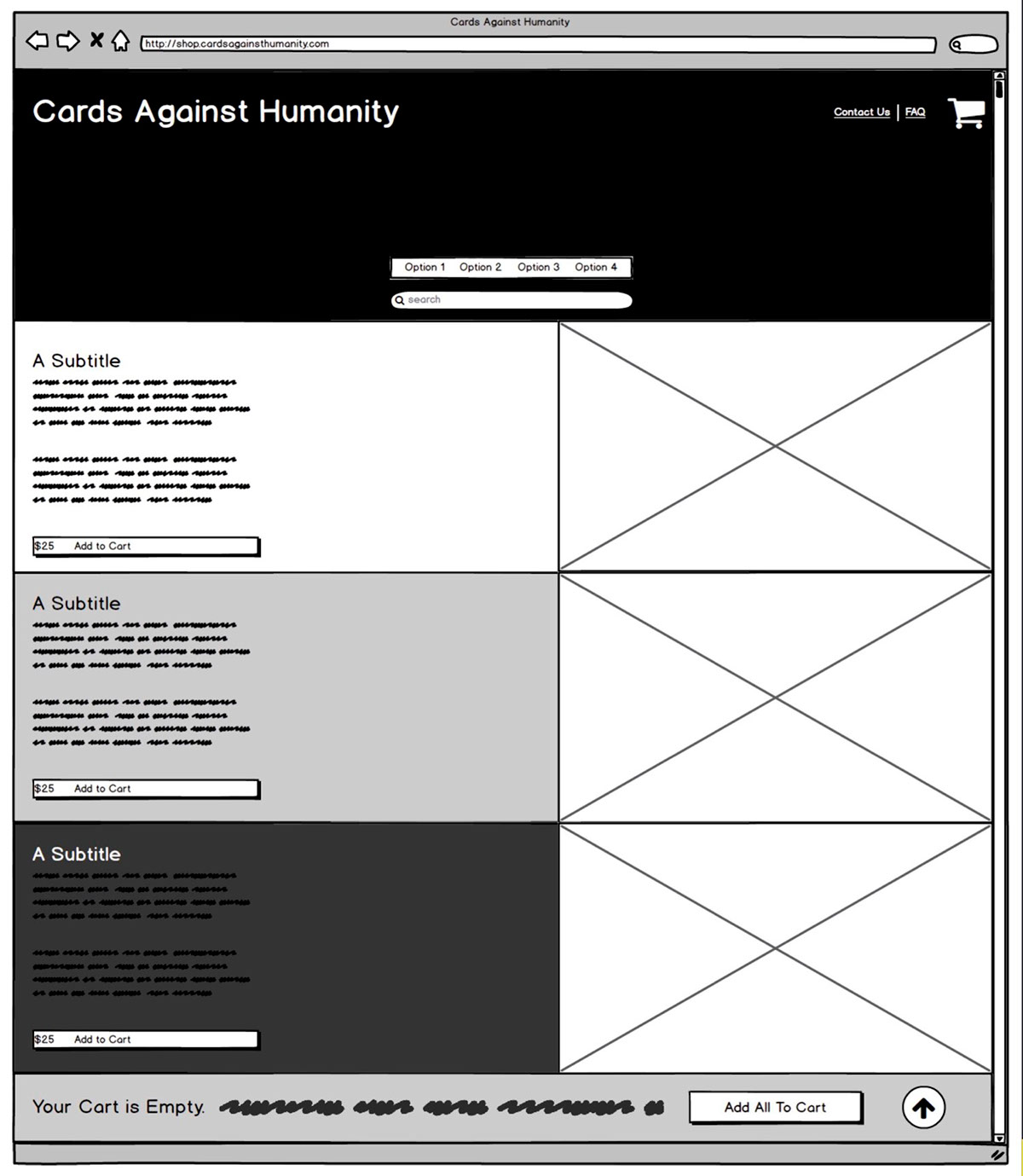
For this first draft of the wireframe I decided to use Balsamiq. I included the static items to the site that I am going to add. These static items include the search bar, the filter options, the cart at the top (which will also include a drop-down when scrolling - similar to what they have now). In the sticky tab at the bottom I am adding a back to top button as the shop page gets a little long. The layout of the shop will stay pretty similar. I am planning on changing fonts and some small designs as well, but that is for more of the high fidelity wireframes/prototypes.


Test 2 Wireframes


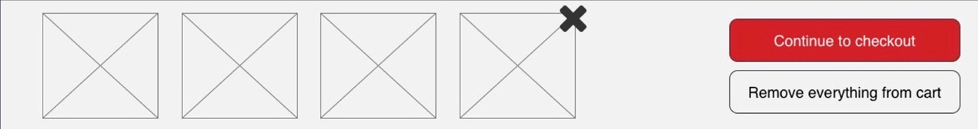


For this second draft of the wireframe I decided to use Axure. I included the static items to the site that I am going to add. These static items include the filter options, the cart at the top (which will also include a drop-down when scrolling - similar to what they have now). In the sticky tab at the bottom I am adding a remove all from cart option, along with an easier way to remove individual items. The layout of the shop has stayed pretty similar.
Stakeholder Grids
While putting together the stakeholder grids I realized some pretty interesting things. I found that in the priority grid the users/shoppers and testers had be kept satisfied because they are the one that are going to be using your site on a regular basis. In that same grid I found the classmates and the instructor were to be kept informed about the process and had little power about what ultimately made it onto the final wireframe.
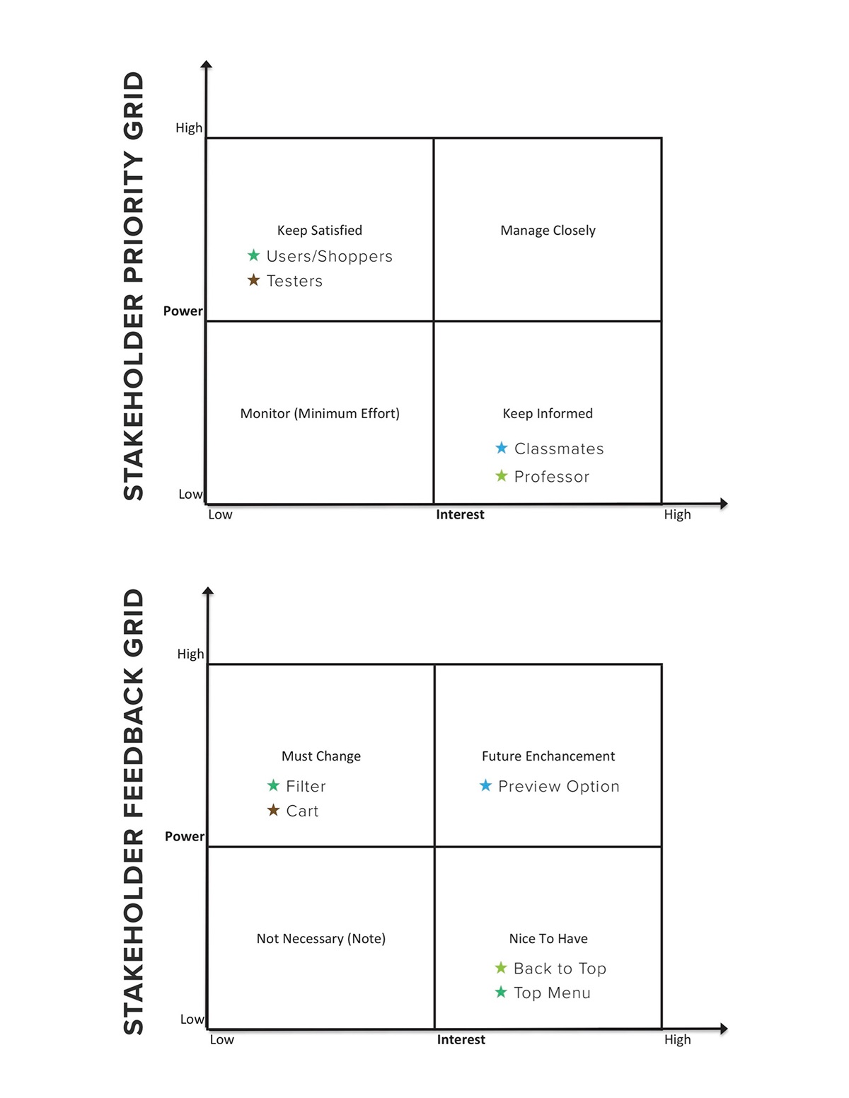
In the feedback grid I was reassured on the things I was having to change. I found during testing that all the users mentioned the filter and cart. This made those two items must change items for the final wireframe. All the users also said having an option to preview cards from different packs nice and would influence their purchase, hence why I put it under future enhancements. Two out of the three final testers had said that it would be nice to have a back to top button and a top menu option. These has been placed in the nice to have section and some what included in the final wireframe.
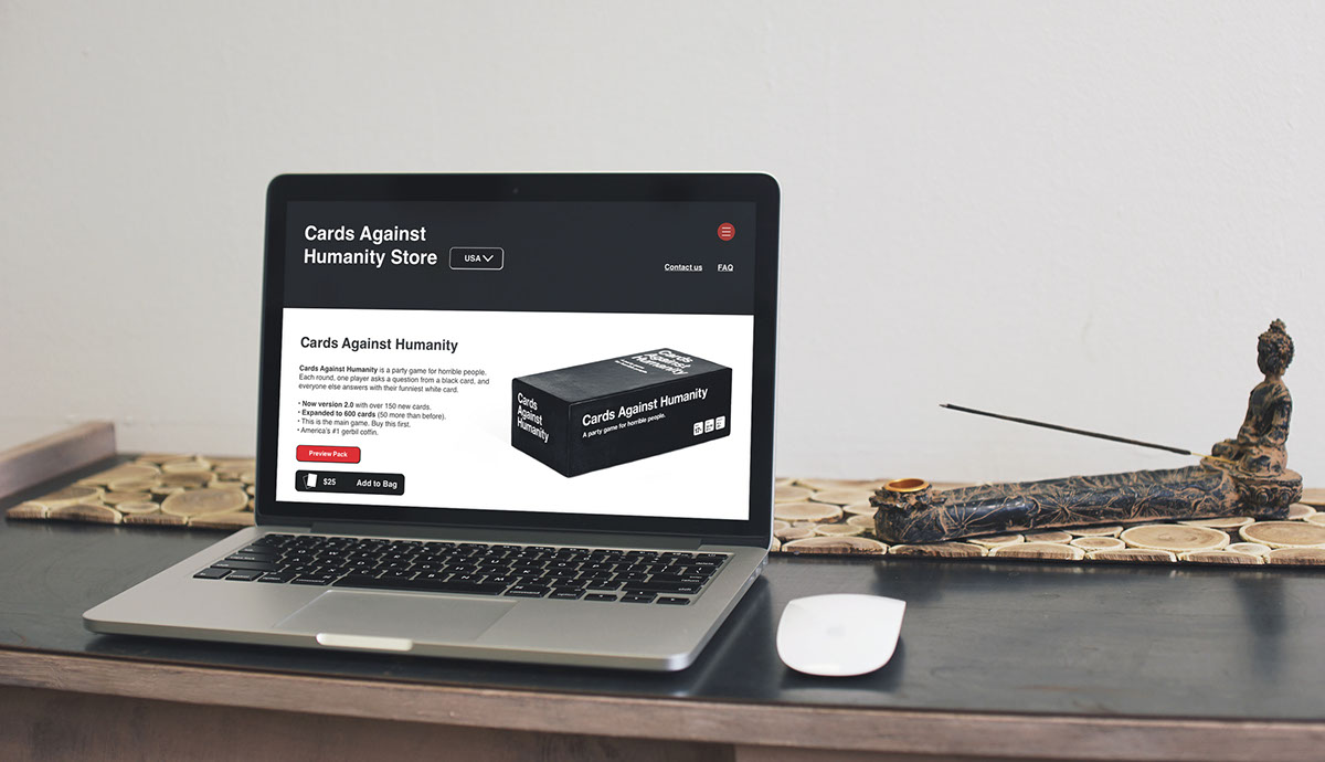
Final Website Redesign
For this final draft of the wireframe I decided to continue using Axure. This final redesign has taken into consideration everything that I have learned during the class so far. It has also taken into consideration all of the feedback I have gotten from my peers and from my use testers.
The final outcome is a complete redesign of the CardsAgainstHumanity.com home page and shop/cart page. The design itself has stayed similar to the original site, but the functionality and icons have changed.
I made it a goal to not lose the modern and minimalist feel that Cards Against Humanity has. I feel like I managed to accomplish this task.
The following is a link to the working Axure prototype: http://kcolz4.axshare.com/
Please keep in mind that not all the links work, only the ones relevant to this redesign process.


